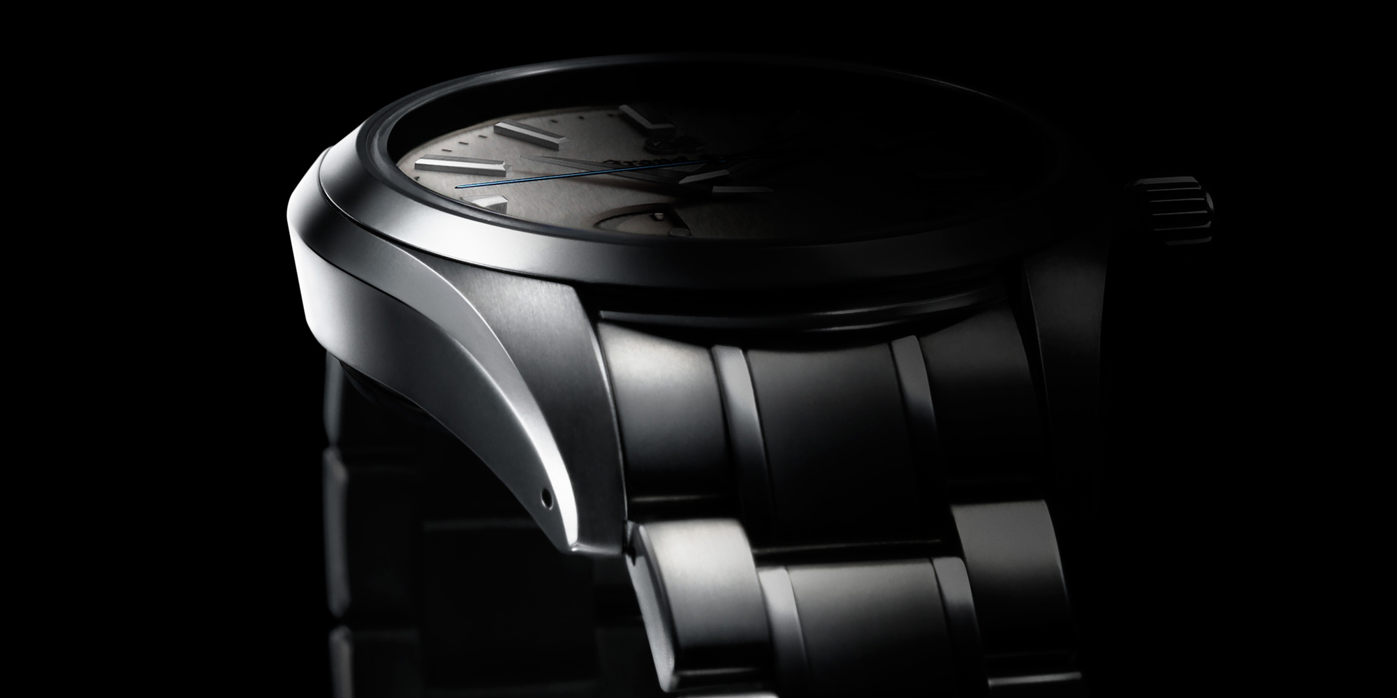
Light and shadow are treasured concepts in Japanese culture, and the delicate interplay of the two are infused in the everyday lives of Japanese people, from utensils to architecture to traditional art such as Sado, the Japanese tea ceremony, and Kado, the art of flower arrangement. Unsurprisingly then, light and shadow inform Grand Seiko’s distinct design language, and this long-cherished Japanese aesthetic can be seen throughout the brand’s catalog.
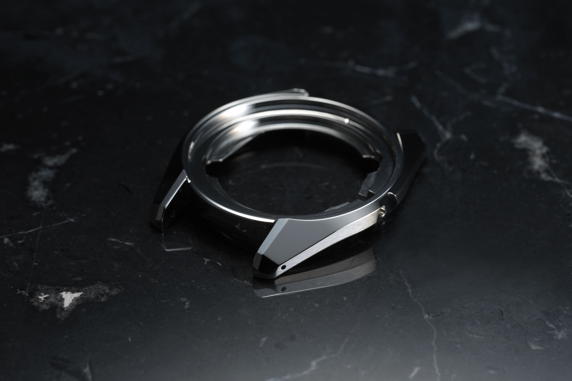
The exterior of every Grand Seiko watch case features several highly polished, distortion-free surfaces, something that is made possible via the brand’s Zaratsu polishing technique. As a result, the cases capture and reflect light even when there is little of it available, contrasting reflective surfaces with dark areas where the shadows sink. This technique of bringing out the magnificence of light by juxtaposing it with shadow, an expertly executed exercise in contrast, is central to the Japanese idea of beauty.
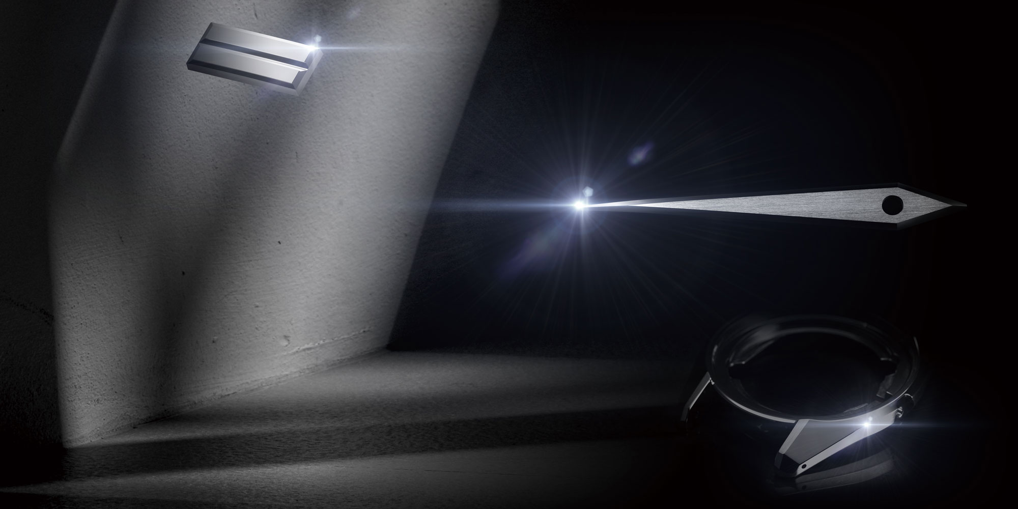
At the core of the Grand Seiko Style is the idea that every single timepiece should have the “sparkle of quality.” This notion is at the heart of the Grand Seiko aesthetic, and it is informed by the abovementioned balance of light and shadow.
The Grand Seiko Style has three guiding design principles:
– The design should be made of a combination of flat surfaces and two-dimensional curves, with the greater focus on the flat surfaces, and three-dimensional curves should not be used.
– The case, dial, and hands should have as many flat surfaces as possible.
– As many surfaces as possible should be mirror-polished and distortion-free.

The key to the beauty of any Grand Seiko watch is striking a fine balance between the distortion-free, mirror-polished surfaces created by Zaratsu polishing, and the hairline finished surfaces. Just as light and shadow co-exist, mirror-polished surfaces and hairline finished surfaces are also intimately connected, and, together, they too create many expressions of light and shadow.
To ensure the legibility that Grand Seiko demands, each watch has a dial that is a perfect backdrop for its respective hands and markers. Contrast is central to high legibility. This is why the multi-faceted hour and minute hands and indexes feature different finishes depending on the color of the dial. In most instances, bright dials use a mirror finish with a diamond cut for the hour and minute hands and indexes, and dark dials use hands with a hairline finish.

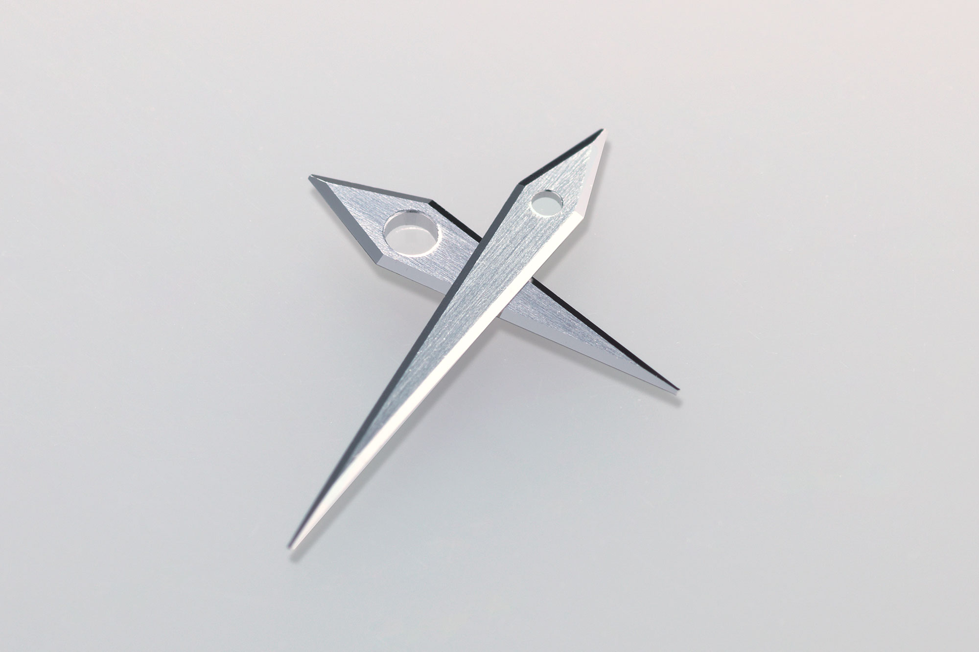
It is done this way because a hairline surface is not only less affected by reflections from ambient light, but it also reflects light diffusely, making the hands easier to see against a dark surface. In contrast, a distortion-free mirror surface does not reflect light diffusely, and the hands can get lost against a dark dial, so they’re best suited for lighter backgrounds.
In these and other ways, the dials and hands express the principle that watches should be legible no matter how little light they receive. To achieve this, the design becomes a masterclass in light and shadow. Altogether, the form of each watch is designed to catch and reflect light gracefully, to create subtle shadows, and to express elegance and legibility.

